Apple Music for Business: Messaging
Researching and designing B2B self-serve audio messaging features


Background
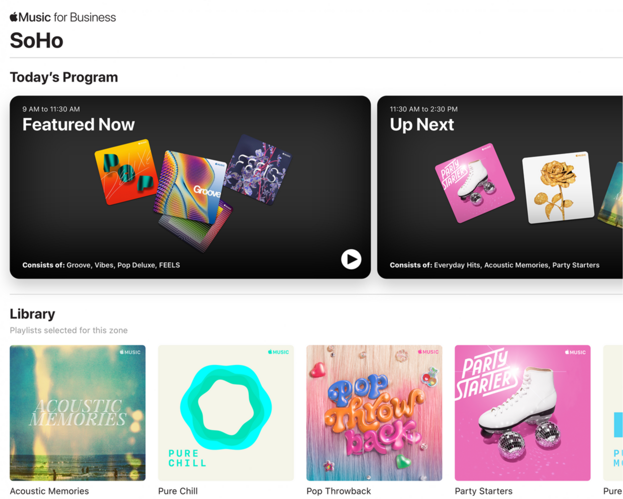
Apple Music for Business by PlayNetwork was a service which enabled retailers, restaurants, hotels and other public-facing establishments to play licensed music in their locations and provided curated playlists as well as custom music schedules that matched with individual venue brands and vibes.
Goal
To provide businesses with an integrated, self-serve tool to harness in-store audio messaging in their marketing strategy and directly communicate with their customers
Role
As the senior UX/UI designer, and project lead, I was responsible for:
- interviewing stakeholders, subject matter experts, and prospective end-users
- identifying and prioritising user segments
- creating integrated service wireflows
- researching and expanding upon Apple’s existing User Interface components and styles
- creating and delivering final User Interface designs to developers
- implementing components with behaviour documentation into the figma design system
Team
1 design manager
1 product manager
1 product analyst
1 production designer
6 MONTH TURN AROUND
Outcomes
Audio Messaging implemented in
15,000+ locations worldwide
Message Program creation time was reduced
from 4 hours > 45 minutes
DISCOVER
User Research
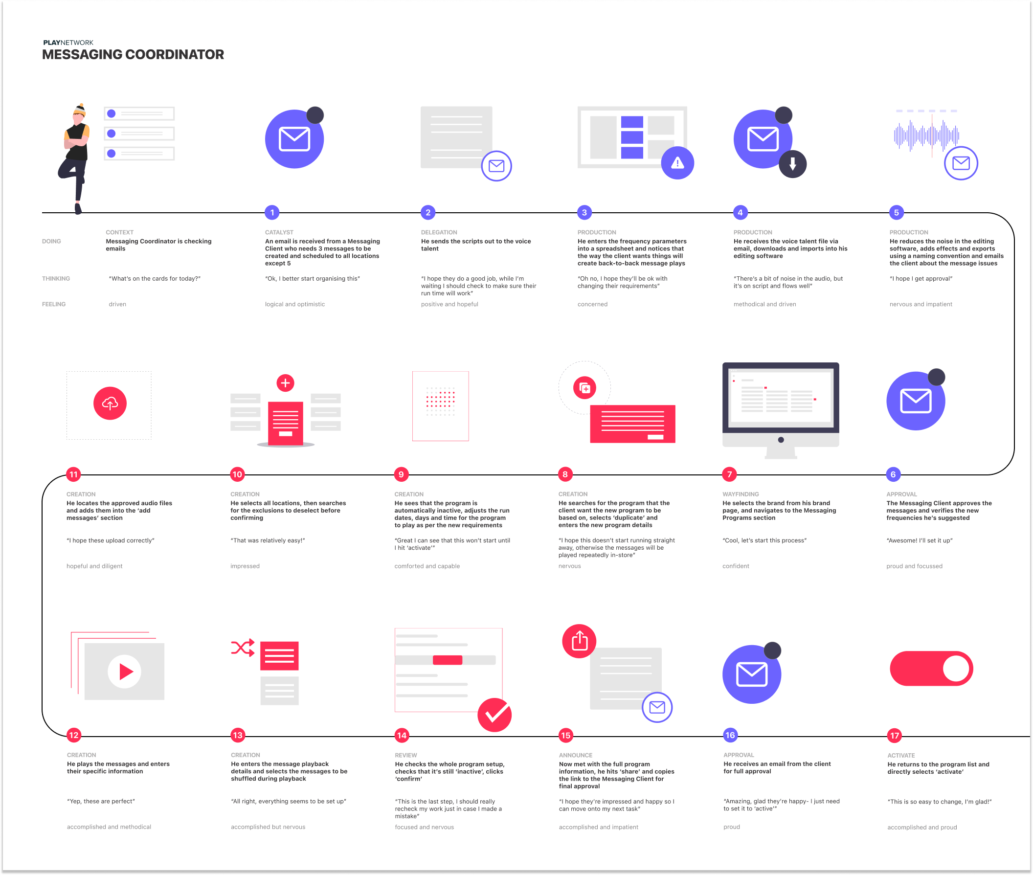
PlayNetwork offered an existing managed messaging service whereby Messaging Coordinators would use an internal tool in order to upload, tag, and schedule audio messages for enterprise customers.
4 client-facing Messaging Coordinators were asked to perform key tasks both inside and outside their current tool in order to gain the full-picture of their everyday responsibilities and processes.
In order to try to understand the processes and needs of Enterprise users — and since existing client interviews were not able to be performed — internal marketing subject-matter-experts and stakeholders in the sales team were interviewed.
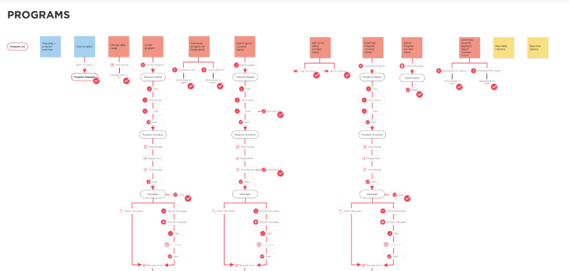
A high-level view of the entire customer facing and web app journey was mapped out in order to understand all influencing factors of the user experiences.
DISCOVER
Findings
- The steps users had to take to create a program were incredibly complex, and not intuitive
- There were a number of additional features that had been tacked on to an MVP which required a number of work-arounds
- There was no way to see an overview of all information linked to a location, program, or campaign
- Every new program had to be created from scratch for each location as duplication or bulk actions were not possible
- The reporting system used to keep clients updated with programs was only available in csv format which was difficult for the client to understand
Time taken for Messaging Coordinators to create and schedule a single Messaging Program for one client:
4 hours
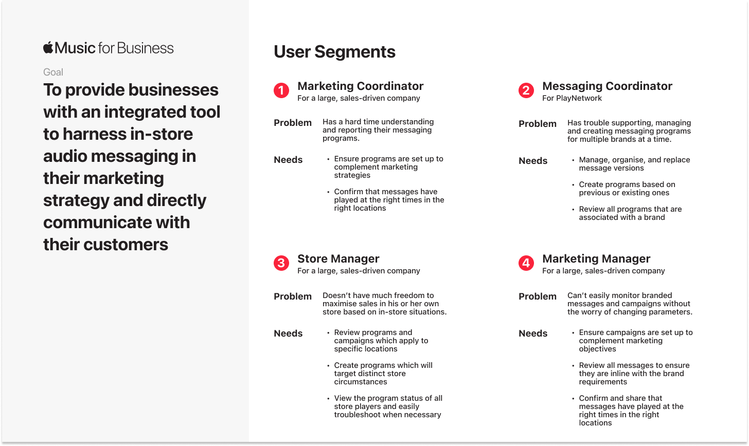
As a result of the interviews and exercises carried out, 4 main user segments were created along with their respective problem statements and goals.

DEFINE
Scope
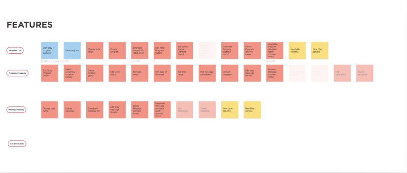
Card sorting exercises were held to inform a feature map and Information Architecture trees were created in order to map out North-Star features and then prioritise them according to bandwidth, engineer estimates, and release deadlines.
The recommendation was to create the following main areas:
- Messaging section within the main navigation that by default directs to a Messaging Campaign Dashboard
- Program page with secondary navigation to see the Schedule, Targeted Locations and Report
- Messaging Setup Wizard allowing users to set up and fine-tune their Programs
- Message Library containing all uploaded audio messages
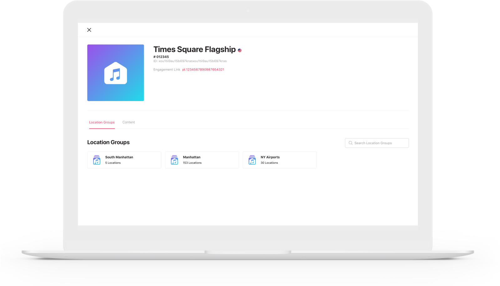
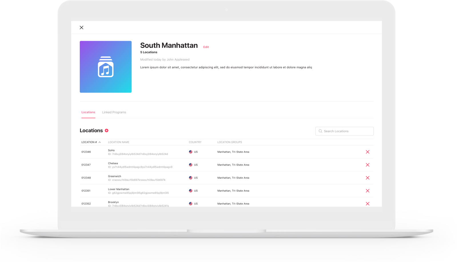
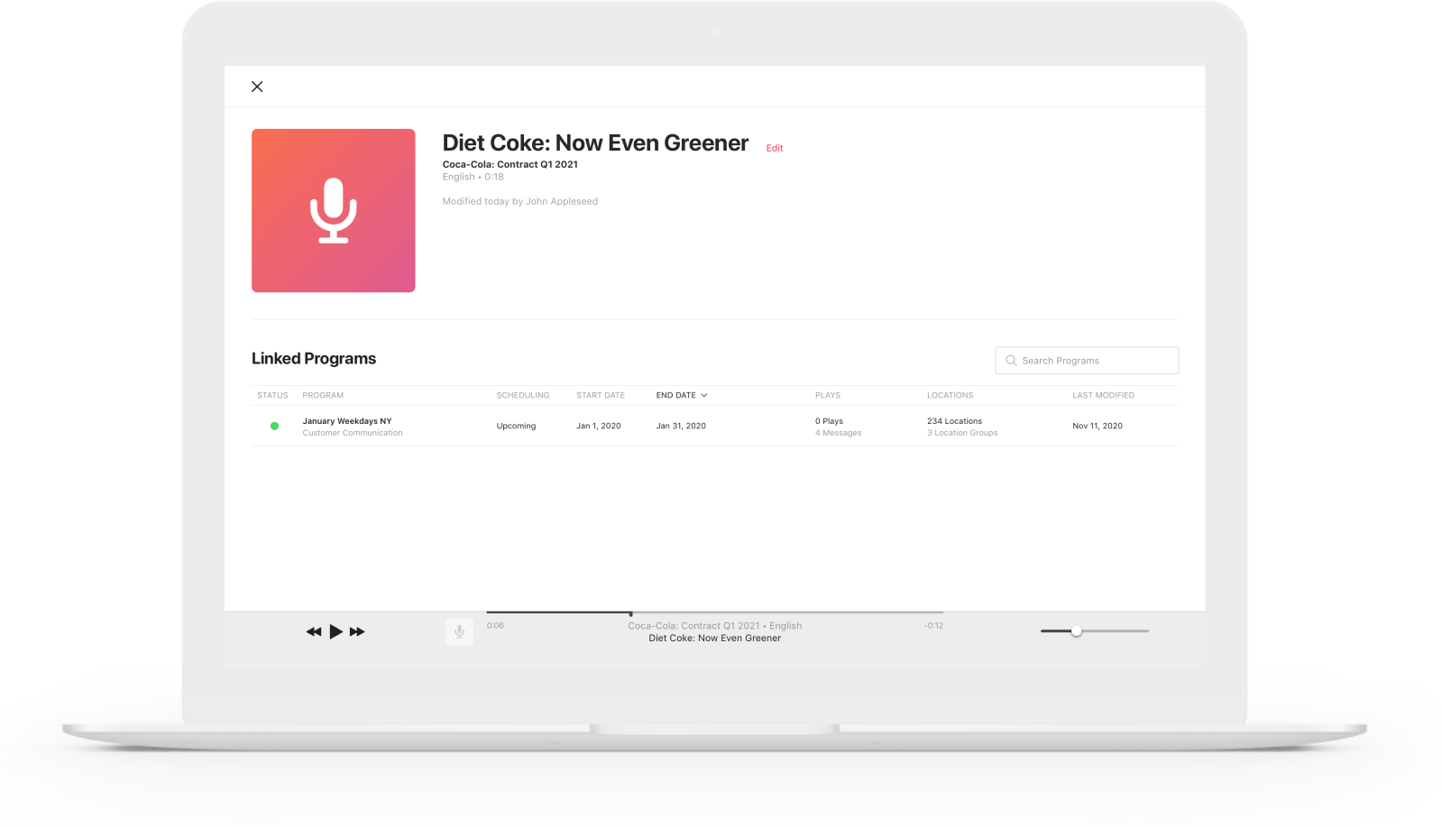
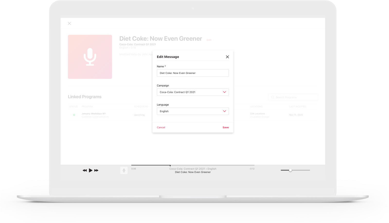
- Details pages for messages, locations and location groups
MMP flow journeys were created in order to guide sitemap and wireframes.
IDEATE
User Experience
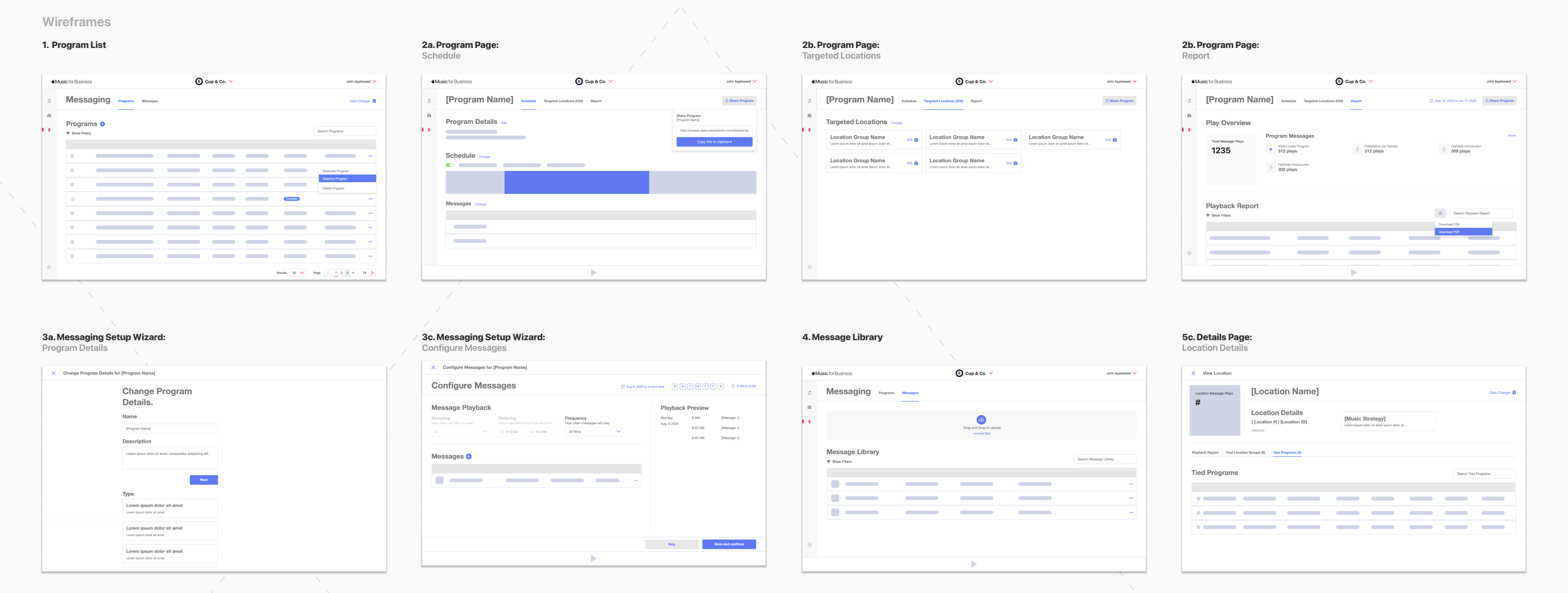
Wireframes were created, made into prototypes using inVision, and 6 unscripted usability sessions were held amongst target users, internal stakeholders, as well as by internal employees unfamiliar with the project.
Wireframes were adjusted according to the feedback, and presented to Apple for approval before being presented to the Product Analyst to begin writing Acceptance Criteria.
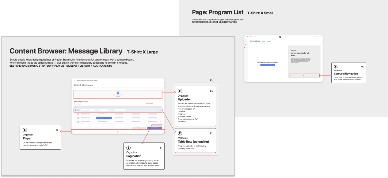
Pages and features were then broken down, components were scoped out and t-shirt sizing estimates were made based on component & organism complexity.
IDEATE
User Interface
External benchmarking was done on tools that each user segment may be familiar with: from ad-management and marketing campaign tools to CRM software.
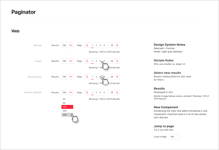
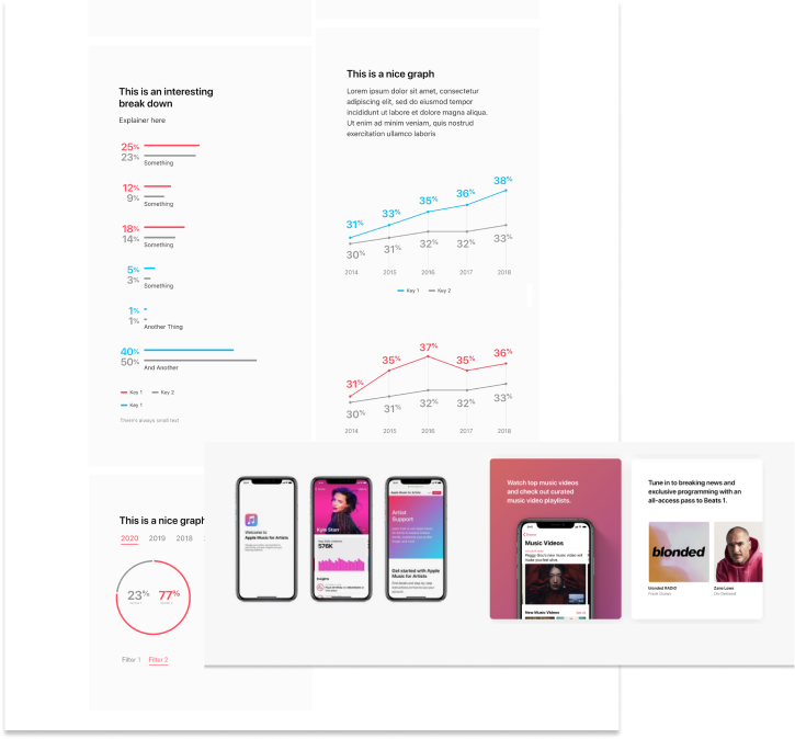
Apple’s existing web and desktop products were explored to garner which existing components exist in the ecosystem that might serve our User Interface purposes. When components didn’t quite meet the user needs, new elements were presented alongside rationale and for introduction to Cupertino for approval.
SELF-SERVE & VIEW-ONLY
Program List
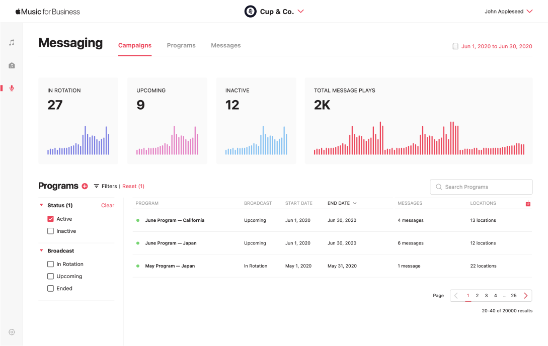
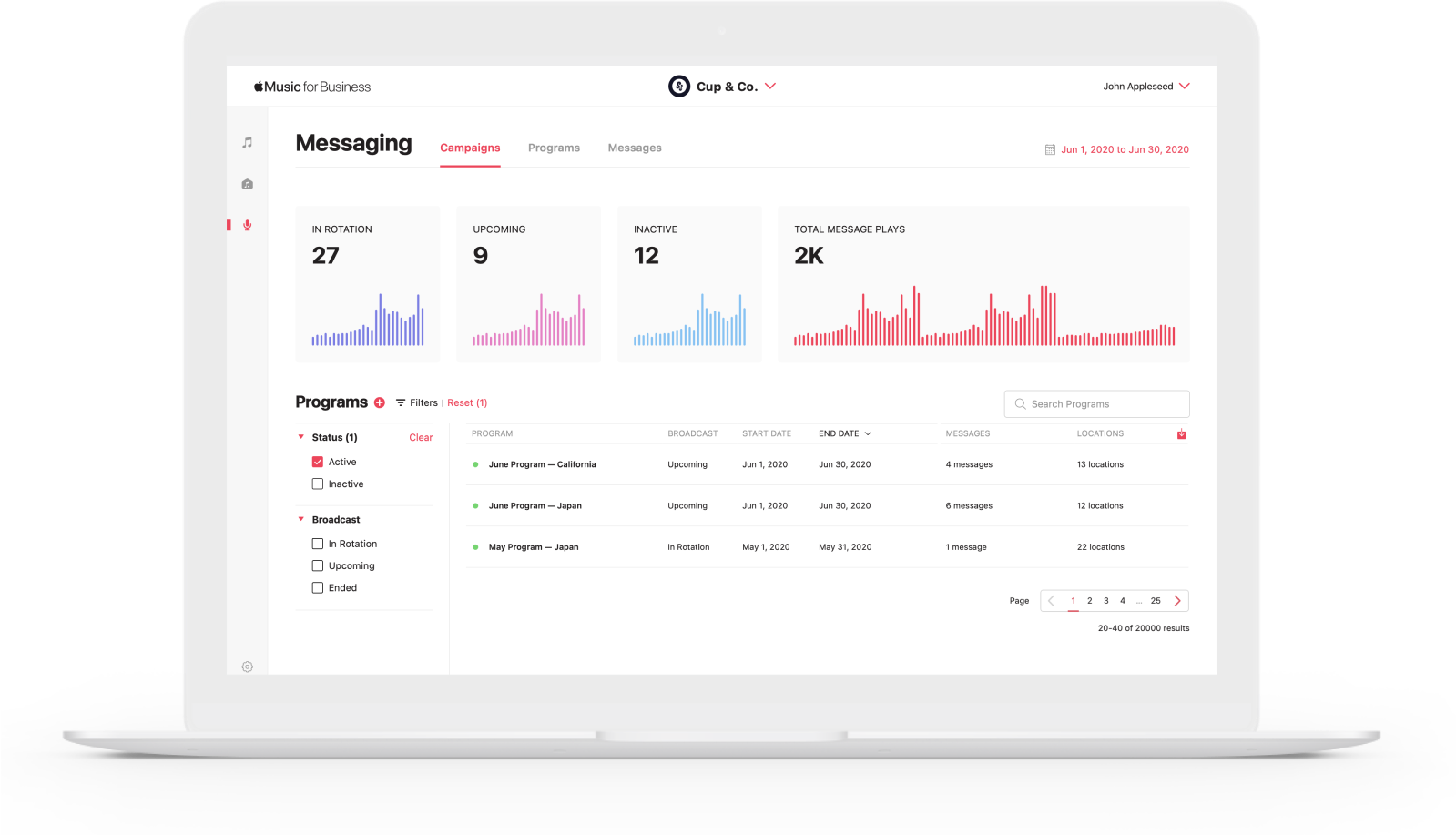
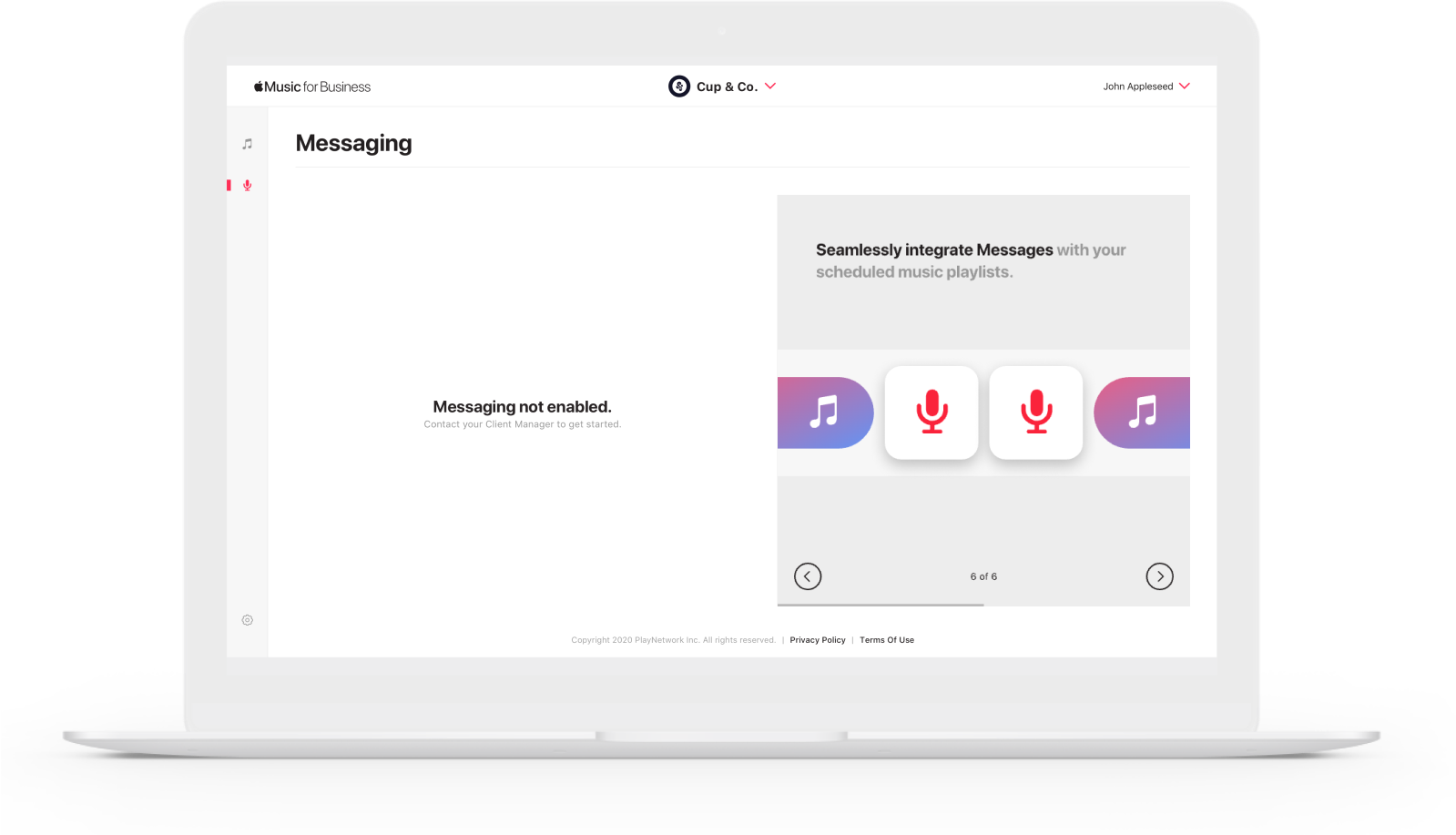
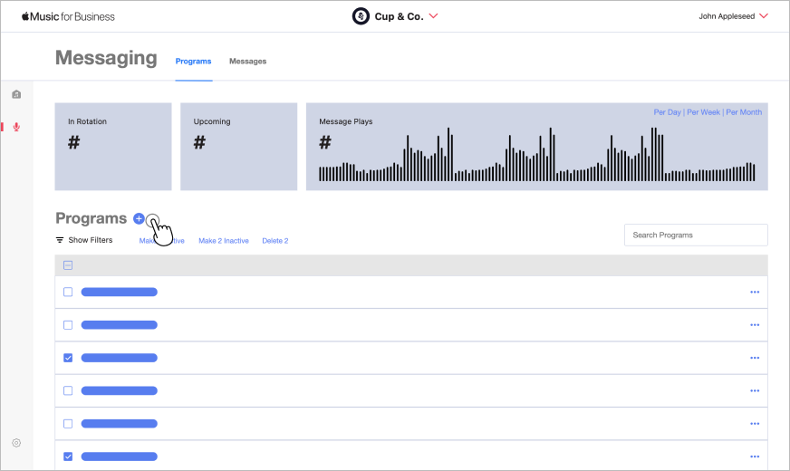
Introducing a new Messaging section in the main side menu allowed for quick navigation and discoverability.
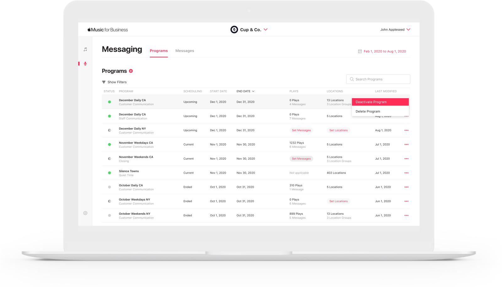
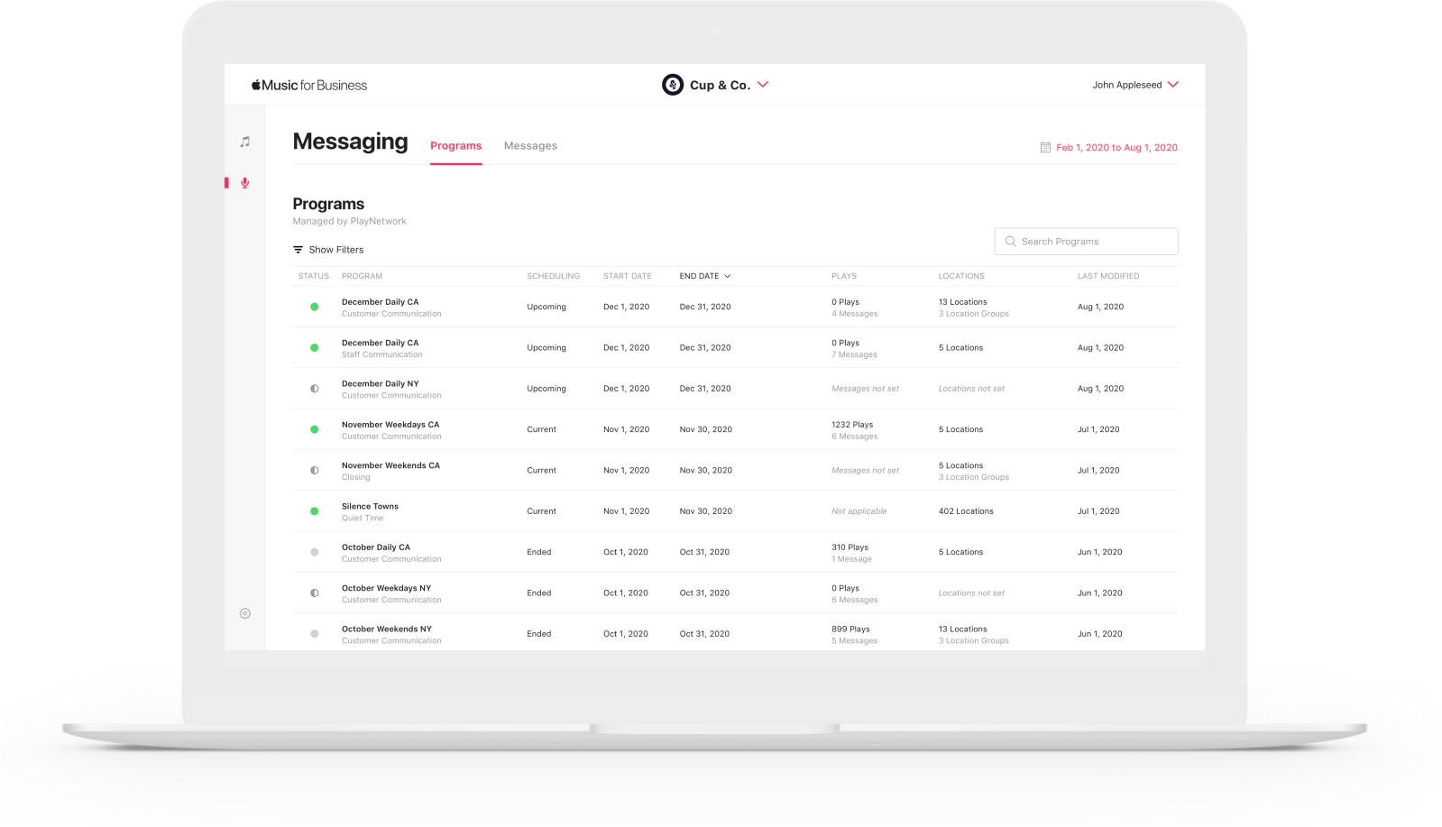
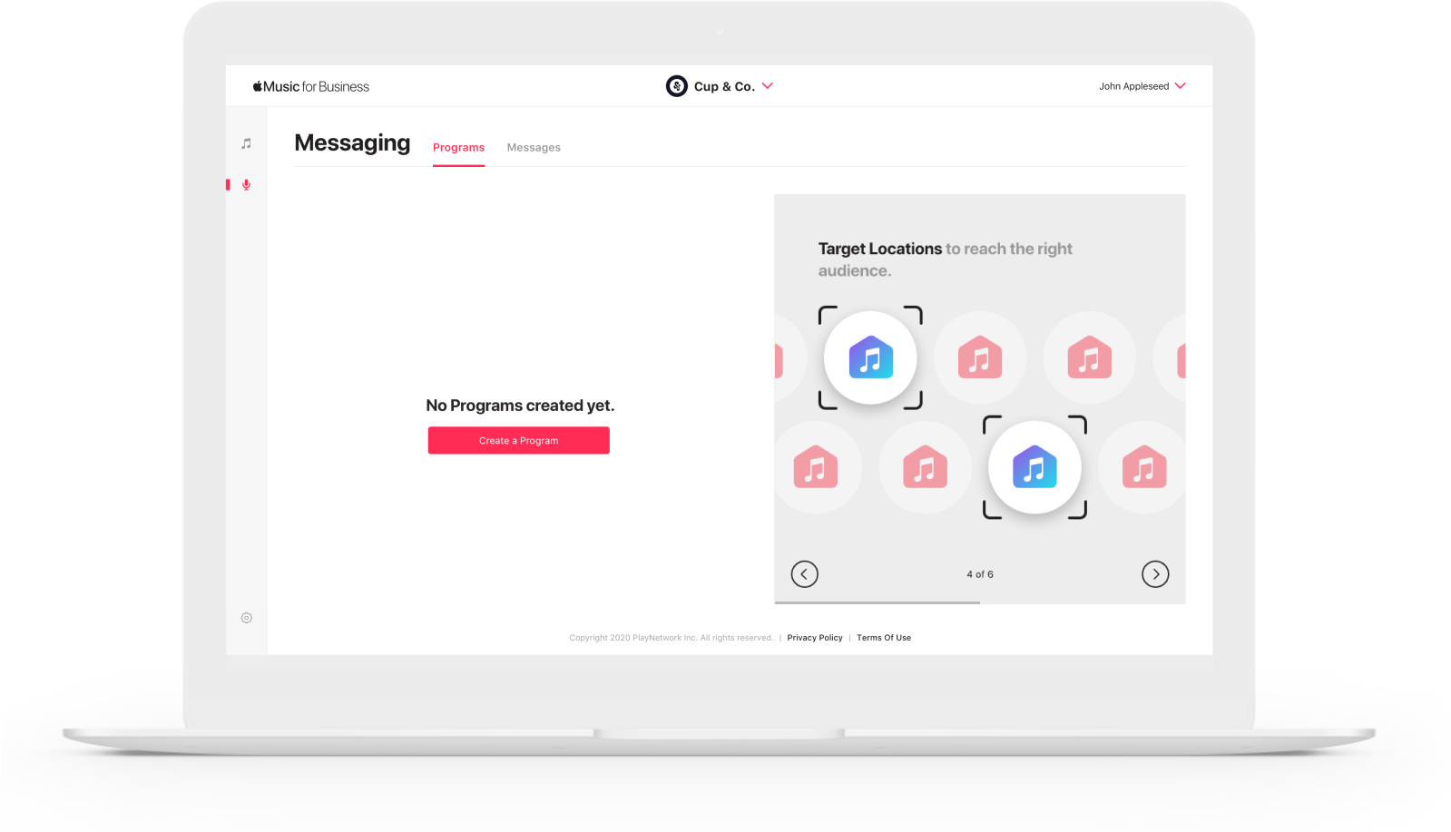
The dashboard allows users to see visual statistics at a glance, and table list view with sorting, search, and filtering functionality facilitates user management and comprehension tasks.
The empty state includes a carousel for feature on-boarding, or marketing messages for up-selling if the client has not yet subscribed to the feature.
SELF-SERVE & VIEW-ONLY
Program Page
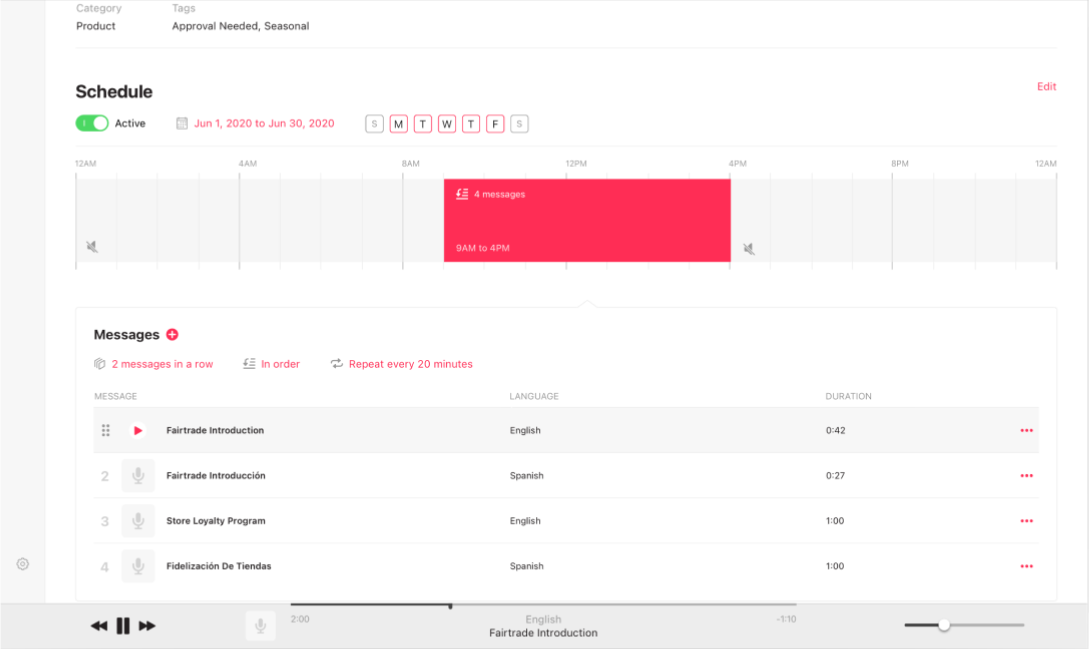
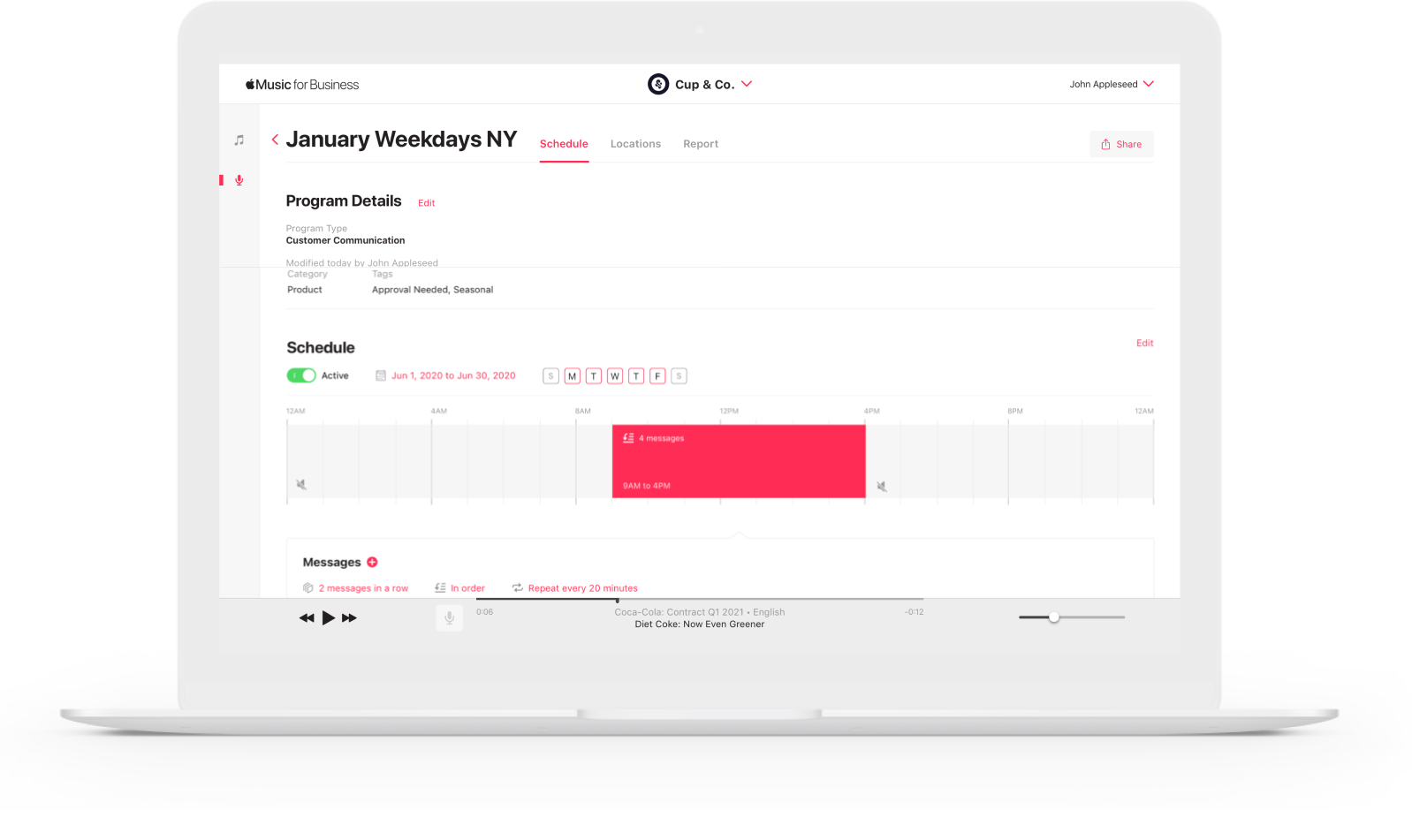
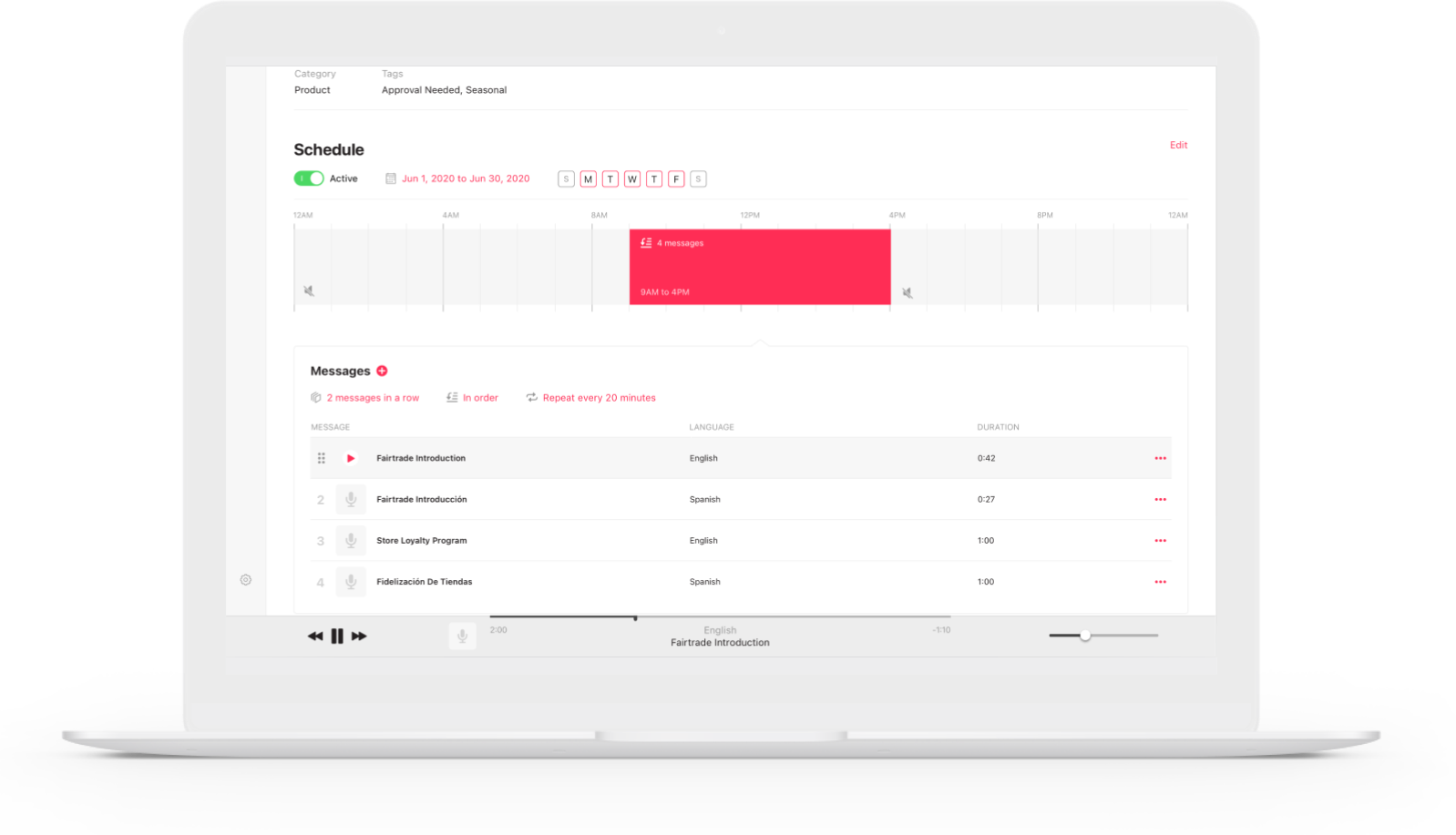
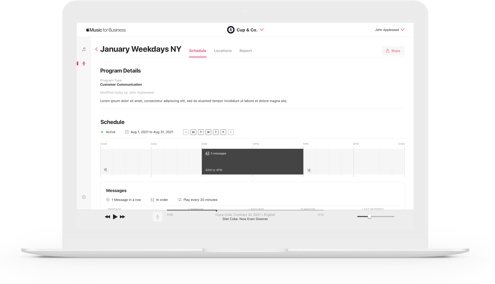
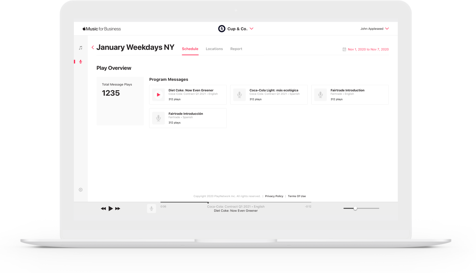
The program schedule page allows the user to see detailed schedule information about the time block, message order and run dates of a particular program as well as featuring the ability to preview, adjust, or change the assigned audio messages.
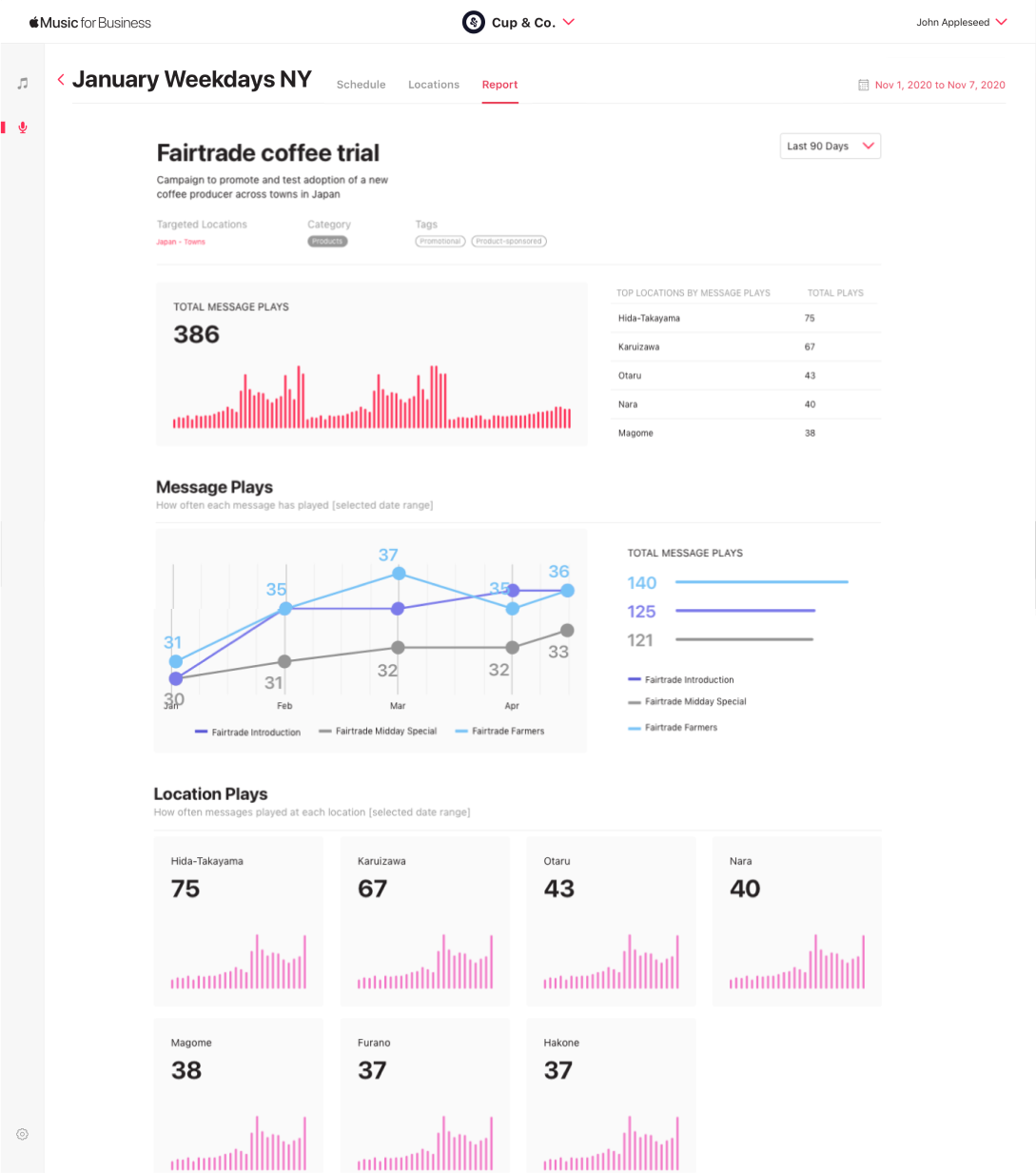
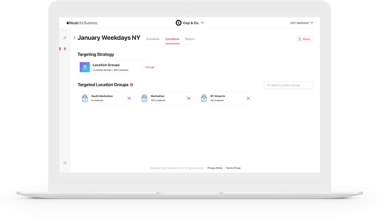
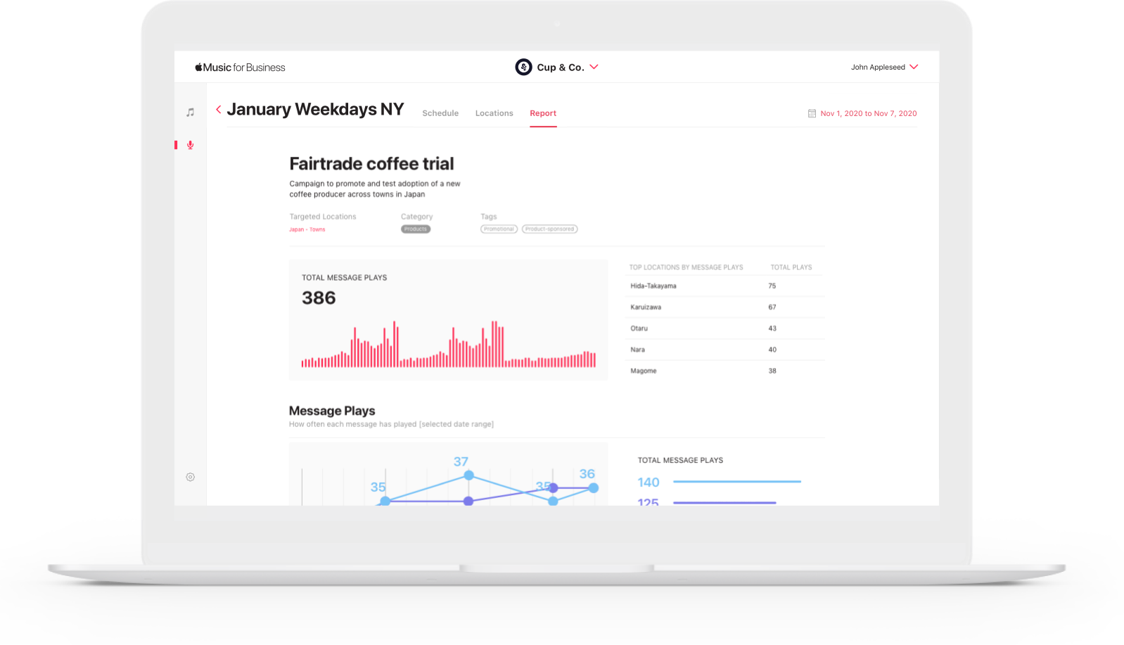
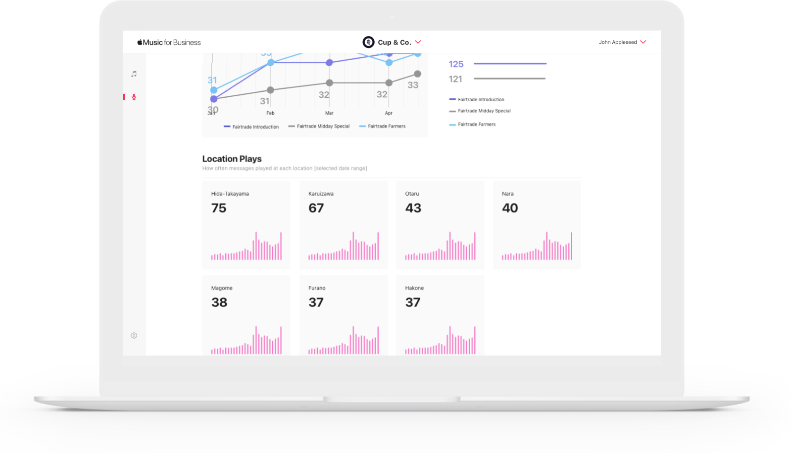
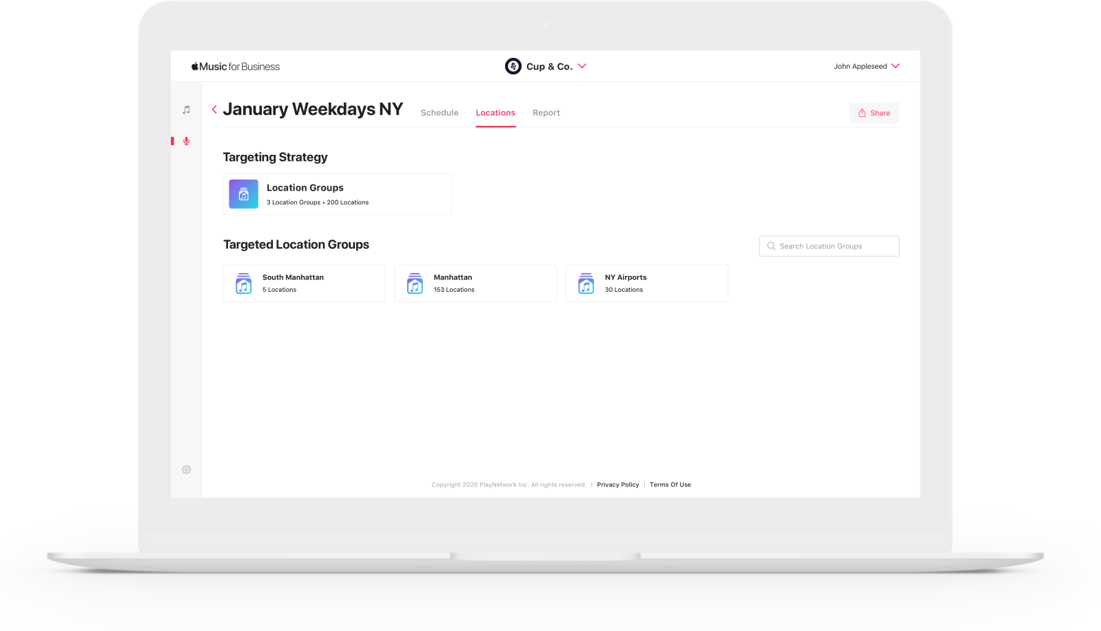
A secondary nav made it easy for the user to view and change the locations and location groups linked to the program, and also view or download comprehensive play reports for any selected date range.
SELF-SERVE
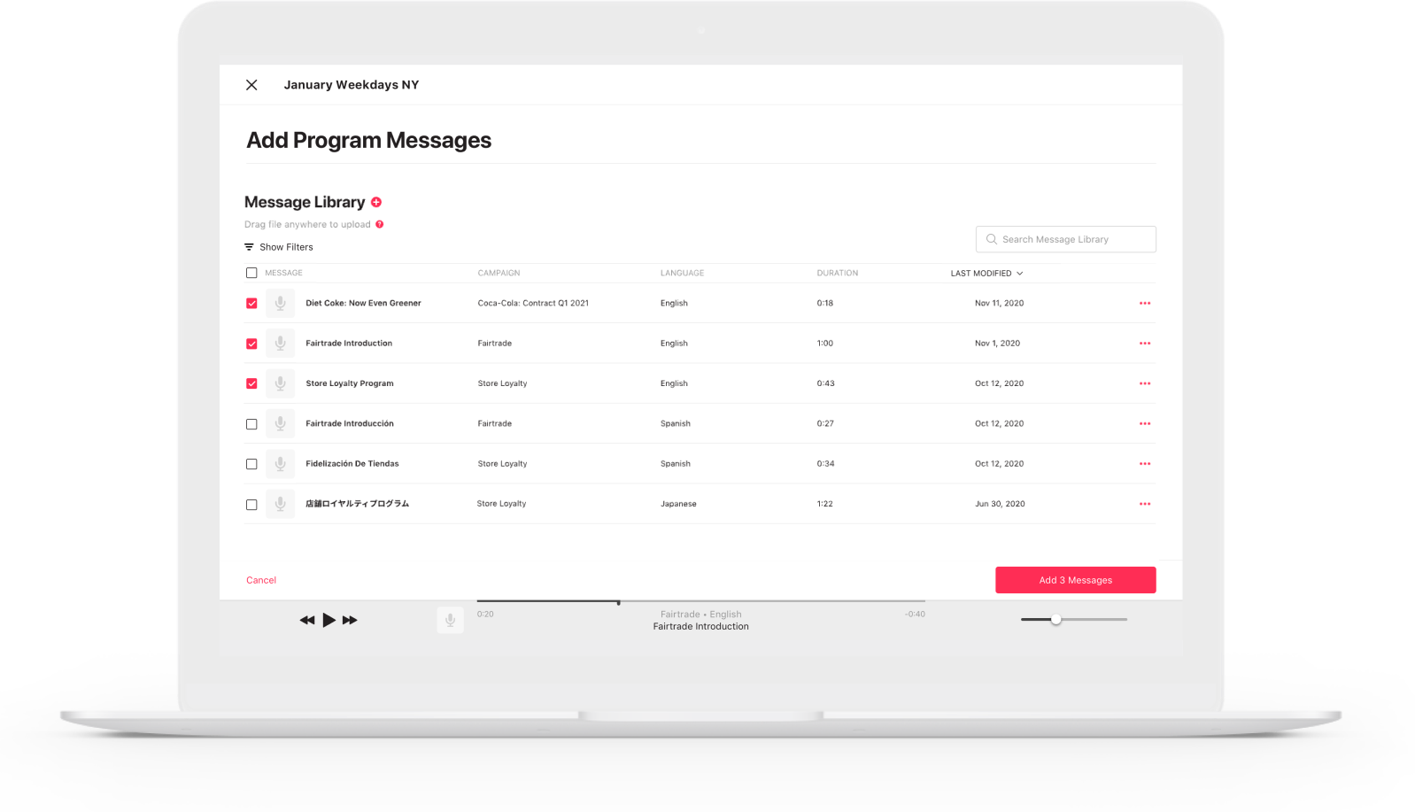
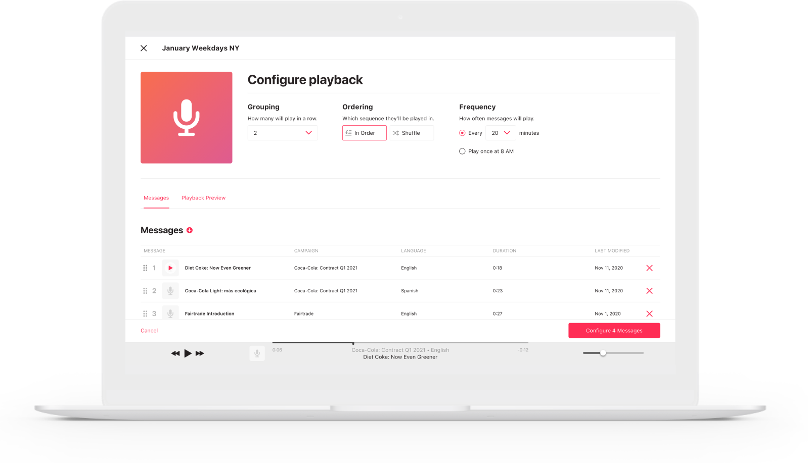
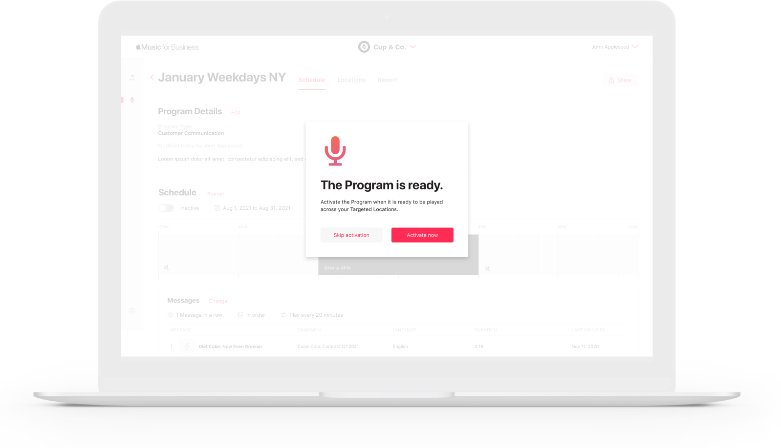
Messaging Setup Wizard
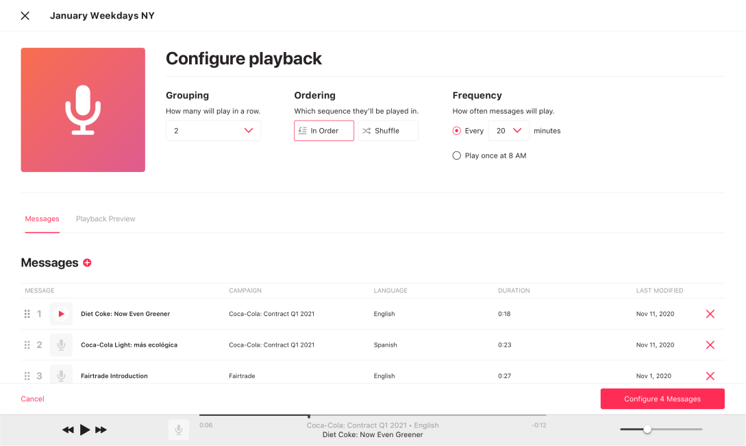
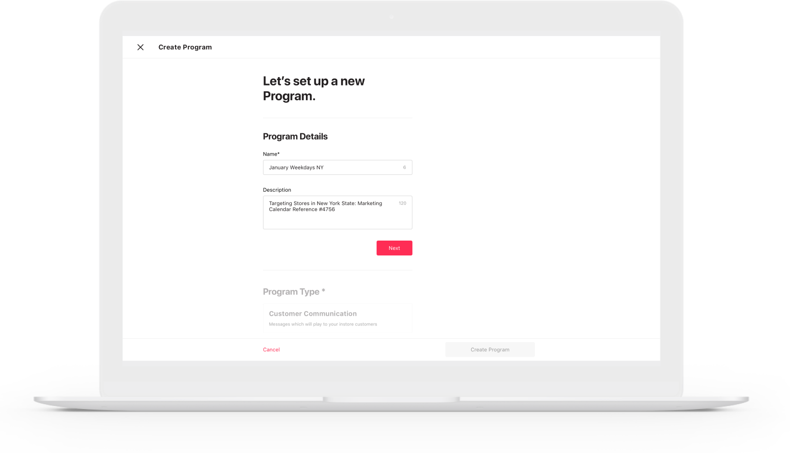
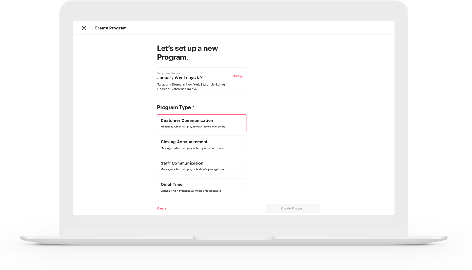
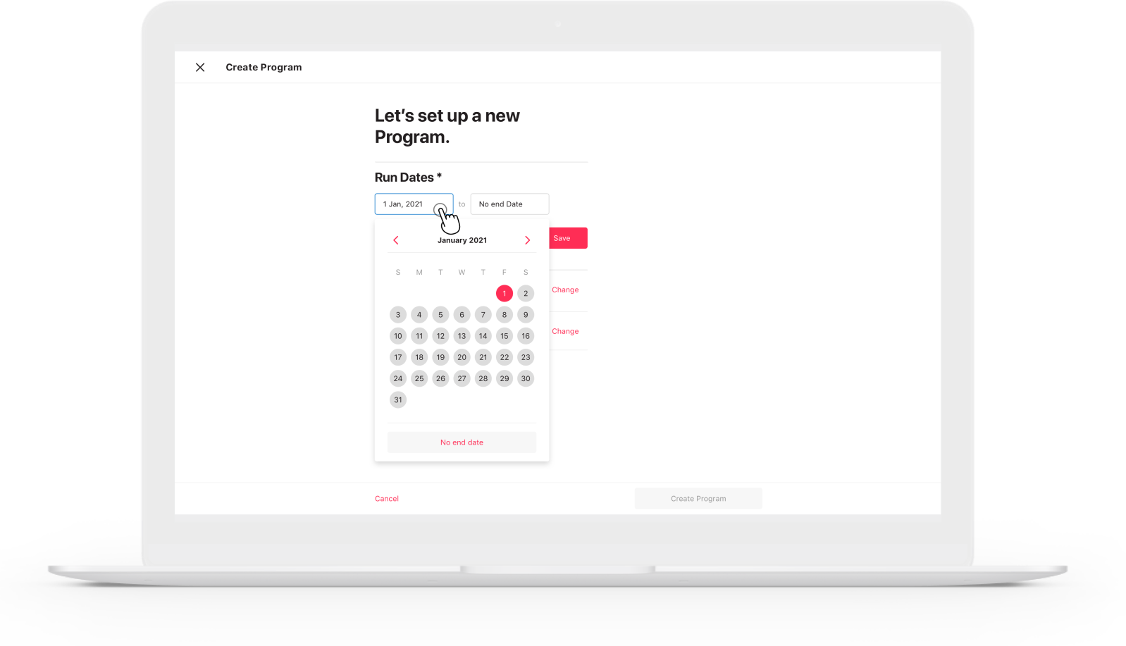
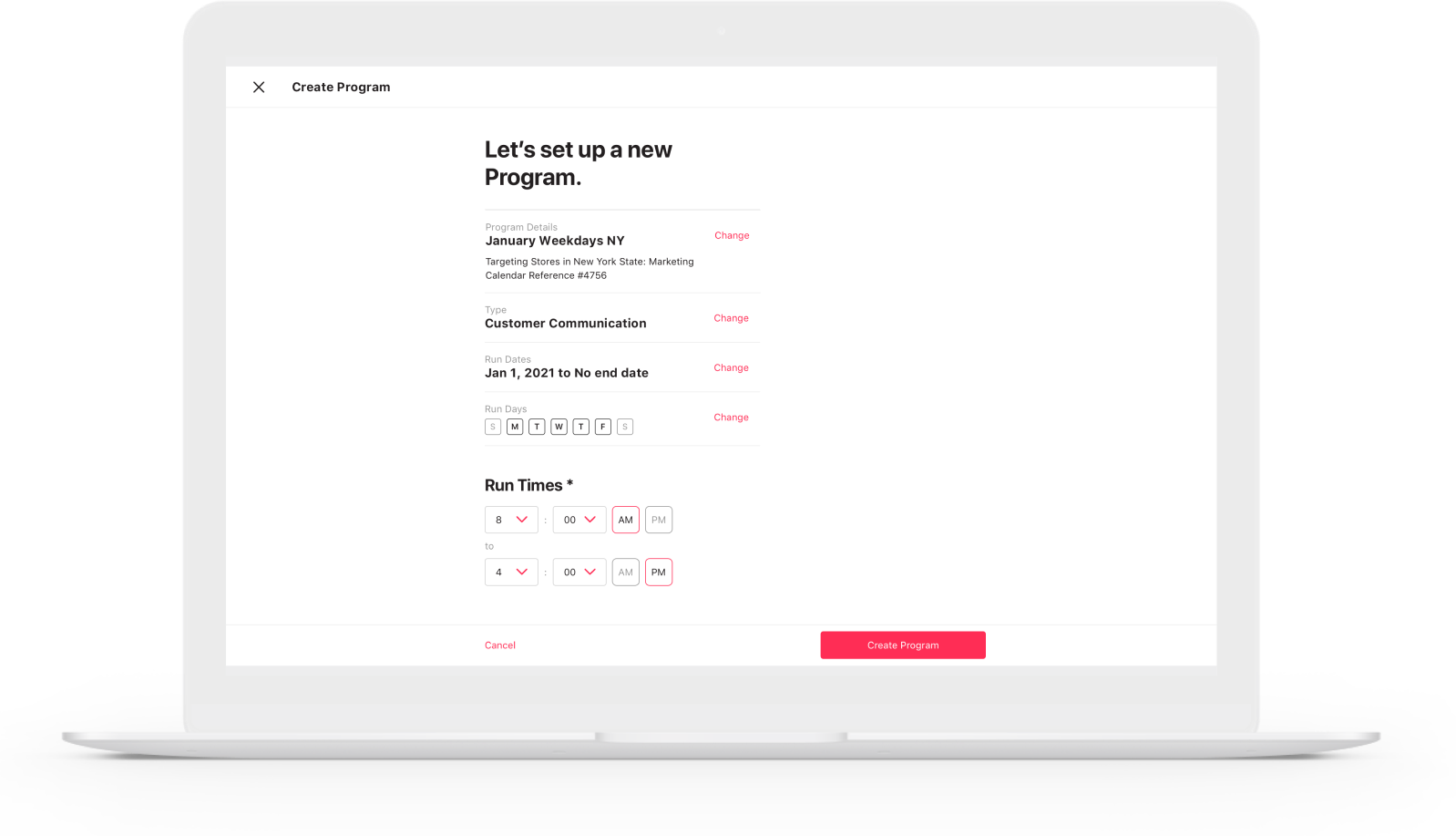
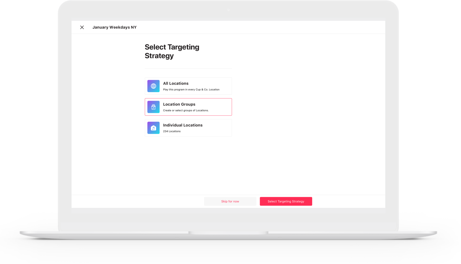
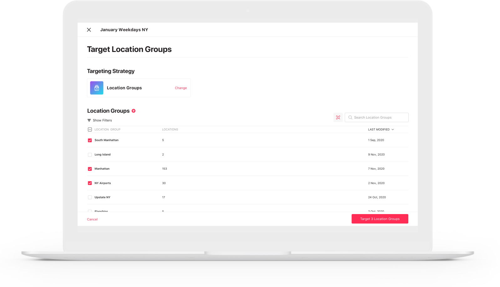
Upon opting to create a new program, the user is met with an easy-to-use, simple, and logical wizard form to complete the steps needed.
Offering a linear guide with the option to skip non-essential information means the user gets more freedom to complete a program in their own time or by collaborating with other users before going live.
At each step they are empowered to create new entries, groupings, and management systems without breaking the flow.
SELF-SERVE & VIEW-ONLY
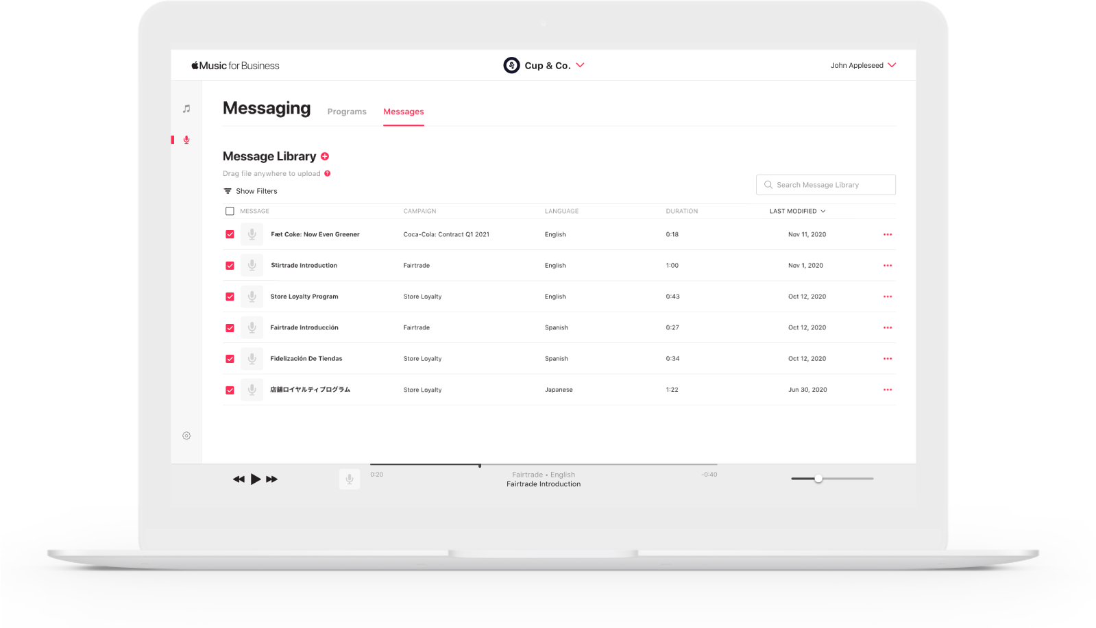
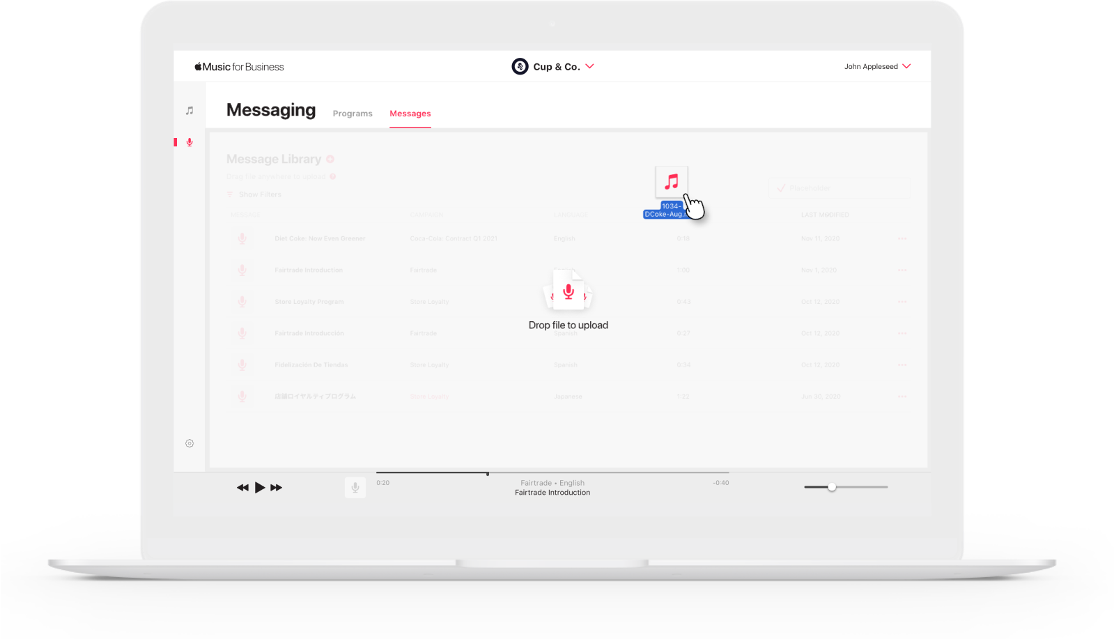
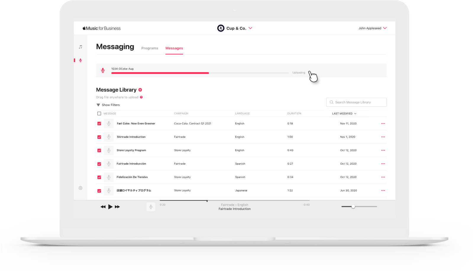
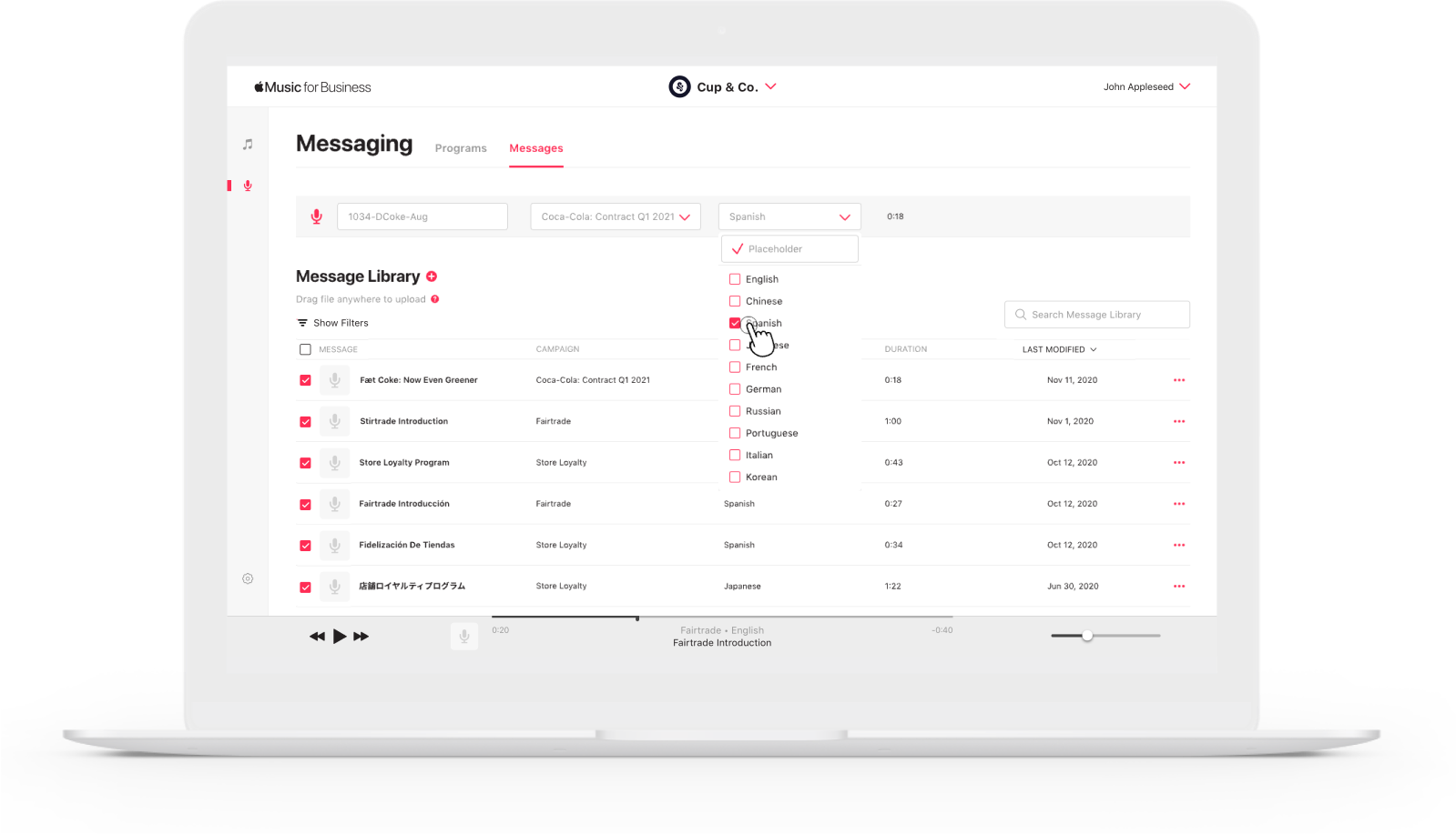
Message Library
Users can have the utmost of flexibility when it comes to tagging audio files. This way marketing teams are able to a/b test and follow different messages, languages, dialects, gendered voices in order to best achieve their goals.
They are able to upload directly through the platform reducing the wait time that would be incurred with a middle-person.
SELF-SERVE & VIEW-ONLY
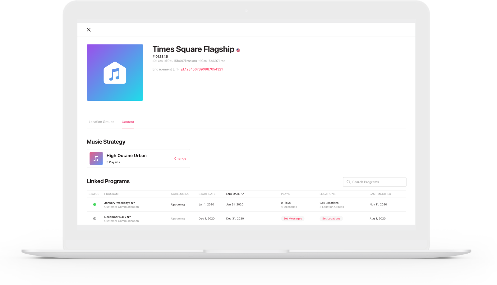
Details Pages
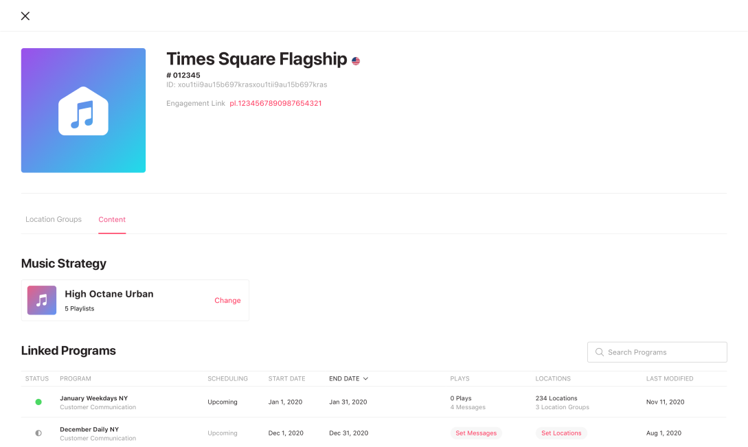
To get more visibility into what’s going on across potentially thousands of stores at any given moment, it was imperative that program information was displayed in location, location groups, and message detail information.
By linking these entities, the user can quickly gauge real-time venue, program and message status, and is more able to navigate between areas of the feature through them.
DELIVER
Handoff
Kickoff sessions were held with front-end engineers which walked through the entire product by template and page type.
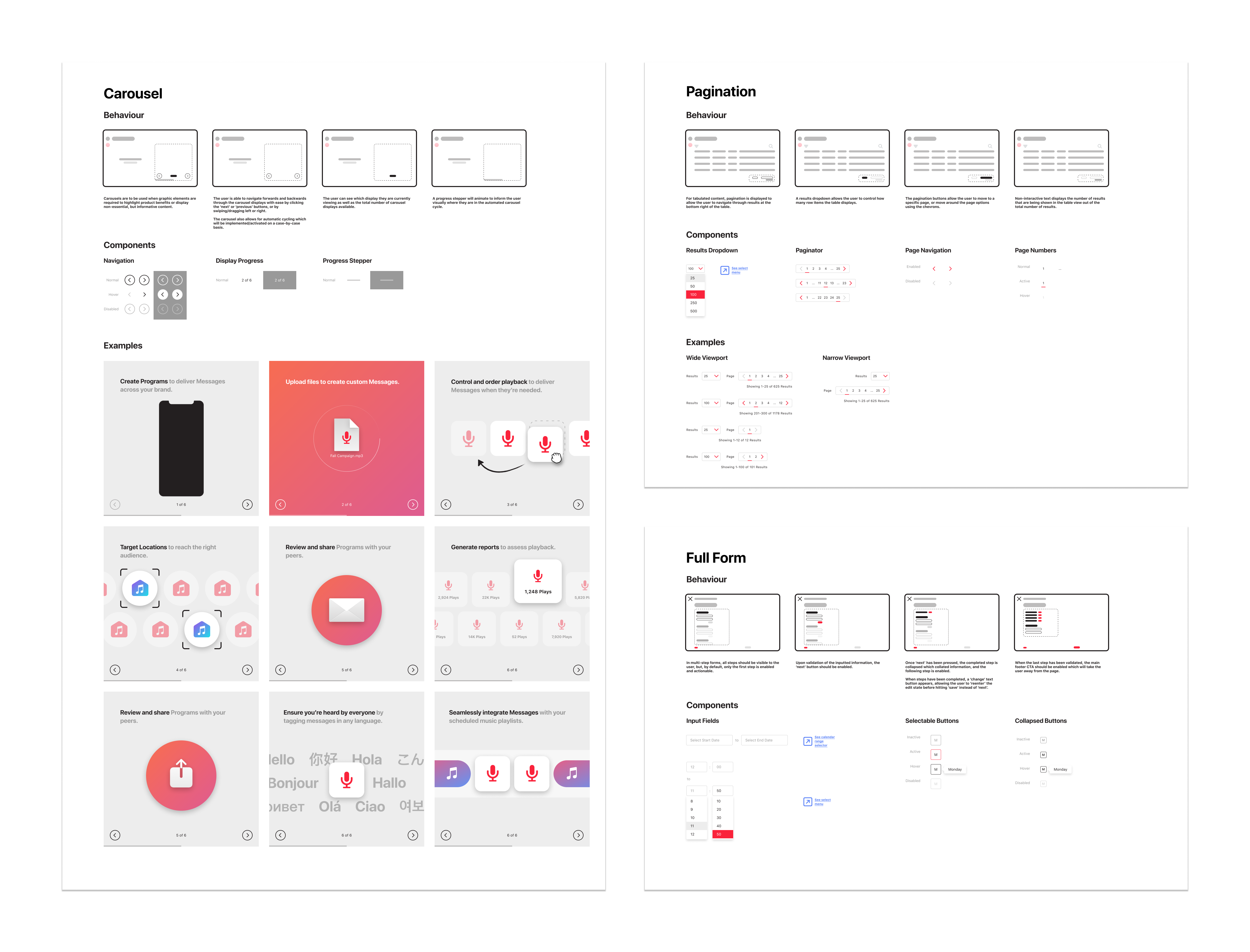
Component behaviours were included as documentation to ease future design decisions, and developer handoff.
Outcomes
Audio Messaging implemented in
15,000+ locations worldwide
Message Program creation time was reduced
from 4 hours > 45 minutes

